Graphic Semiology Fundamentals
Introduction to Graphic Semiology
Graphic semiology studies how visual elements act as a language to encode, communicate, and process information. Pioneered by Jacques Bertin, it formalizes the grammar of graphics: how visual variables (symbols, signs, marks) represent data in diagrams, maps, and networks. Bertin’s thesis is that graphics constitute a system with its own syntax and semantics, much as in verbal language.
1. Theoretical Foundations
1.1. Graphics as Language
- Graphics are a visual code, and each constructed image is a message.
- Visual elements (the signifiers) correspond to information components (the signified).
- The goal is to achieve “visual unity,” maximizing both efficiency and global apprehension of a message.
1.2. Historical Evolution
- Bertin's laboratory, the Laboratoire de Graphique, crystallized these principles through interdisciplinary collaboration, handling demands across social sciences, geography, and cartography.
- The 1967 “Sémiologie graphique” was a paradigm shift, bringing a rational, systematic language for visual analytics.
1.3. An example from a research paper
This graph comes from the research paper: Different languages, similar encoding efficiency: Comparable information rates across the human communicative niche by Christophe Coupé, Yoon Mi Oh, Dan Dediu, and François Pellegrino.
Source: Science.org
1.4. [Optional] Information Rate (IR) Definition
- In the graph below, "SR" stands for Speech Rate and "IR" stands for Information Rate.
- Based on Shannon's information theory in the study:
- Information Density ($ID$): Average bits of information per syllable (conditional entropy, accounting for syllable dependencies).
- Speech Rate ($SR$): Syllables spoken per second.
- $IR = ID \times SR$ (bits/second).
- Across $17$ languages, $IR$ averages $\text{\textasciitilde} 39$ bits/s, showing languages encode info at similar rates despite differences in $ID$ or $SR$.
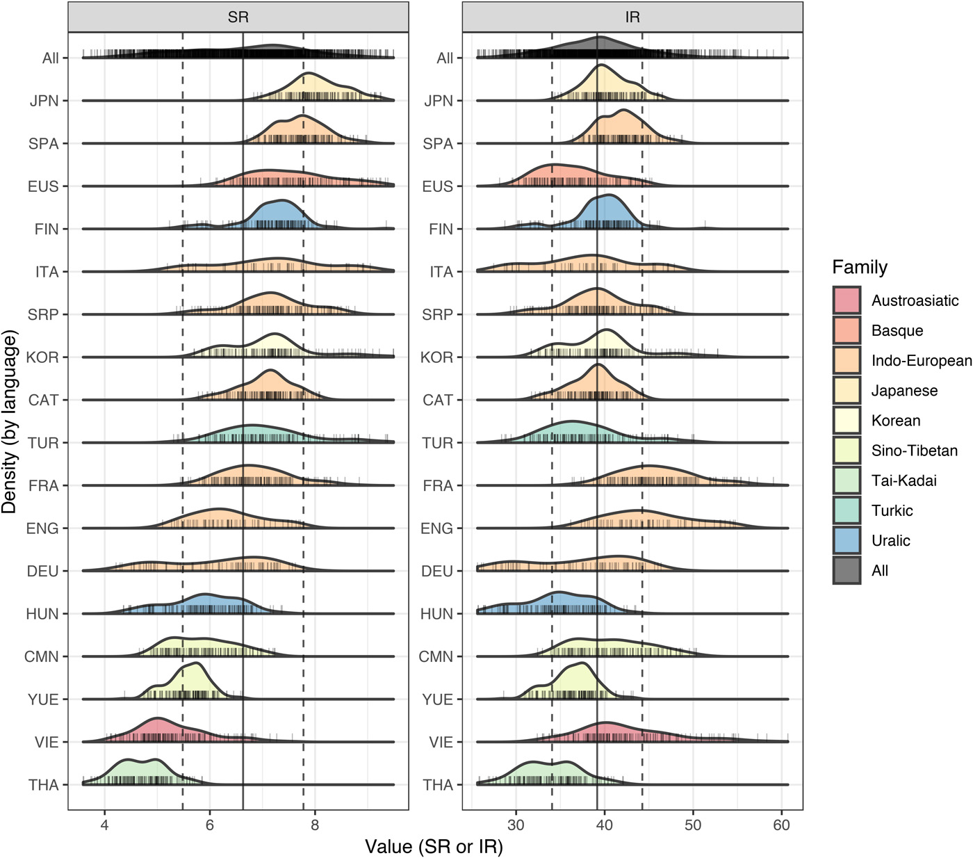
More detailed explanations are available here: Computing Shannon Entropy for Information Density.
1.4. An adaptation from The Economist
This graph comes from the article: Why are some languages spoken faster than others? by The Economist (Sep 28th 2019). Link
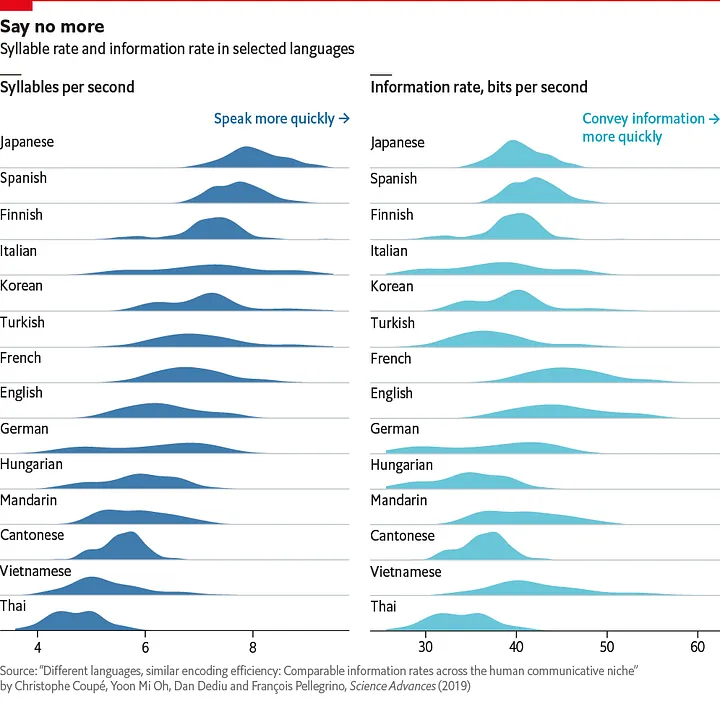
1.5. Discussion
Looking at the two above graphs:
- What are the signifiers ?
- What are the signified ?
- What can we conclude from those graphs ?
- How do they compare in terms of visual unity?
2. Structure of Information
2.1. Theoretical Foundations
- Invariant (Theme/Essence): The unifying core of the data (e.g., a common subject or theme linking all data points).
- Components (Variables/Items): Distinct fields or characteristics in the dataset (nominal, ordinal, quantitative).
- Components can relate differentially (qualitative categories), ordinally (rank/order), or quantitatively (measured scales).
- Graphic System: Theoretical Framework
- The cartographic/graphic “plane” is the two-dimensional space in which elements are organized.
- It translates “plane geometry” into meaningful arrangements: quantities, categories, relationships, or spatial representations.
- Classes of Representation
- Diagrams: Abstract data structures (e.g., time series, bar charts).
- Networks: Relationships among entities (e.g., graphs, flow diagrams).
- Maps: Spatial embedding of data (e.g., geographic maps).
2.2 Datasets used in the following examples
2.3. An example with a bar chart
2.4. 💬 Discussion
Looking at the above graph:
- What are the signifiers ?
- What are the signified ?
- What can we conclude from those graphs ?
- How do they compare in terms of readability and visual unity?
3. Relationships
3.1. Relations and dimensionality
- Key in analysis: how components relate, not necessarily their individual meanings, but their differences and connections.
- For every dataset, determining its dimensionality (number/nature of components) directs the choice of graphic strategy.
3.2. Datasets used in the following examples
100m men world record progression
| Date | Time (s) | Athlete Country |
|---|---|---|
| 1912-07-06 | 10.6 | 🇺🇸 |
| 1921-04-23 | 10.4 | 🇺🇸 |
| 1930-08-09 | 10.3 | 🇨🇦 |
| 1936-06-20 | 10.2 | 🇺🇸 |
| 1956-08-03 | 10.1 | 🇺🇸 |
| 1960-06-21 | 10.0 | 🇩🇪 |
| 1968-06-20 | 9.95 | 🇺🇸 |
| 1983-07-03 | 9.93 | 🇺🇸 |
| 1988-09-24 | 9.92 | 🇺🇸 |
| 1991-06-14 | 9.90 | 🇺🇸 |
| 1991-08-25 | 9.86 | 🇺🇸 |
| 1994-07-06 | 9.85 | 🇺🇸 |
| 1996-07-27 | 9.84 | 🇨🇦 |
| 1999-06-16 | 9.79 | 🇺🇸 |
| 2005-06-14 | 9.77 | 🇯🇲 |
| 2008-05-31 | 9.72 | 🇯🇲 |
| 2008-08-16 | 9.69 | 🇯🇲 |
| 2009-08-16 | 9.58 | 🇯🇲 |
Source: Wikipedia / World Athletics (as of September 2025)
North countries national development profiles
| Country | GDP per Capita | Life Expectancy | Education Index | Happiness Score | Innovation Index | Environmental Score |
|---|---|---|---|---|---|---|
| Norway 🇳🇴 | 75 | 82 | 95 | 76 | 68 | 78 |
| Switzerland 🇨🇭 | 81 | 84 | 88 | 75 | 67 | 81 |
| Denmark 🇩🇰 | 60 | 81 | 92 | 78 | 58 | 78 |
| Iceland 🇮🇸 | 52 | 83 | 95 | 75 | 55 | 68 |
| Netherlands 🇳🇱 | 53 | 82 | 93 | 74 | 58 | 76 |
| Sweden 🇸🇪 | 51 | 83 | 94 | 73 | 63 | 78 |
| Germany 🇩🇪 | 46 | 81 | 93 | 70 | 87 | 77 |
| Canada 🇨🇦 | 46 | 82 | 92 | 72 | 61 | 72 |
| Australia 🇦🇺 | 55 | 83 | 92 | 73 | 46 | 60 |
| Japan 🇯🇵 | 39 | 85 | 85 | 59 | 54 | 65 |
| South Korea 🇰🇷 | 31 | 83 | 85 | 58 | 64 | 63 |
| United Kingdom 🇬🇧 | 42 | 81 | 90 | 70 | 59 | 58 |
| France 🇫🇷 | 40 | 83 | 88 | 66 | 54 | 80 |
| Belgium 🇧🇪 | 47 | 82 | 89 | 69 | 50 | 73 |
| Austria 🇦🇹 | 48 | 81 | 91 | 71 | 45 | 79 |
Source: United Nations Development Programme, World Bank, OECD, WIPO, and World Happiness Report, compiled and normalized (2024–2025)
3.3. An example with a scatter plot
Here we add a regression line to the scatter plot to show the trend of the data. It show how to combine lines and points in the same plot.
Look carefully at the axis: the $y$ axis is inverted, because the faster times are better. This is a common practice in data visualization, it's not mandatory, but it helps to make the plot more readable.
Since not only has the 100m men world record, but also most world records (whatever the sport), been improved continuously during the last century, what can we conclude about the evolution in the field of athletics?
3.4. An example with a heatmap
This example demonstrates how multiple quantitative components relate across different entities. The heatmap reveals patterns, clusters, and trade-offs that emerge from multi-dimensional data without incorrectly connecting nominal categories.
The y-axis is sorted by GDP per capita, descending.
3.5. Another example with a heatmap
3.6. Alternative: Clustered scatter matrix
3.7. Discussion
Looking at the above graph:
- What are the signifiers ?
- What are the signified ?
- What can we conclude from those graphs ?
- How do they compare in terms of readability and visual unity?
- Big findings? Are we this sure ? (For some heatmap values from 3.4, once the economical context of those countries is known, the analysis is pretty clear. But for some others, it's not so obvious.)
4. Visual Variables
This part of the lecture is available here: Visual Variables.
5. Graphic Rules and Grammar
5.1. Problem Construction
- Any graphic is a solution to multiple possible ways to encode the same dataset—the “graphic problem” is to choose the most efficient/legible.
- Design must account for perceptual tasks (lookup, comparison, grouping, pattern search).
5.2. Grammar of Construction
- Density: Avoid excessive clutter, but enough detail for insight.
- Retinal Legibility: Variables should combine without creating confusion.
- Layering/Separation: Different elements must remain perceptually separable (via color, value, or shape).